Research & Publications
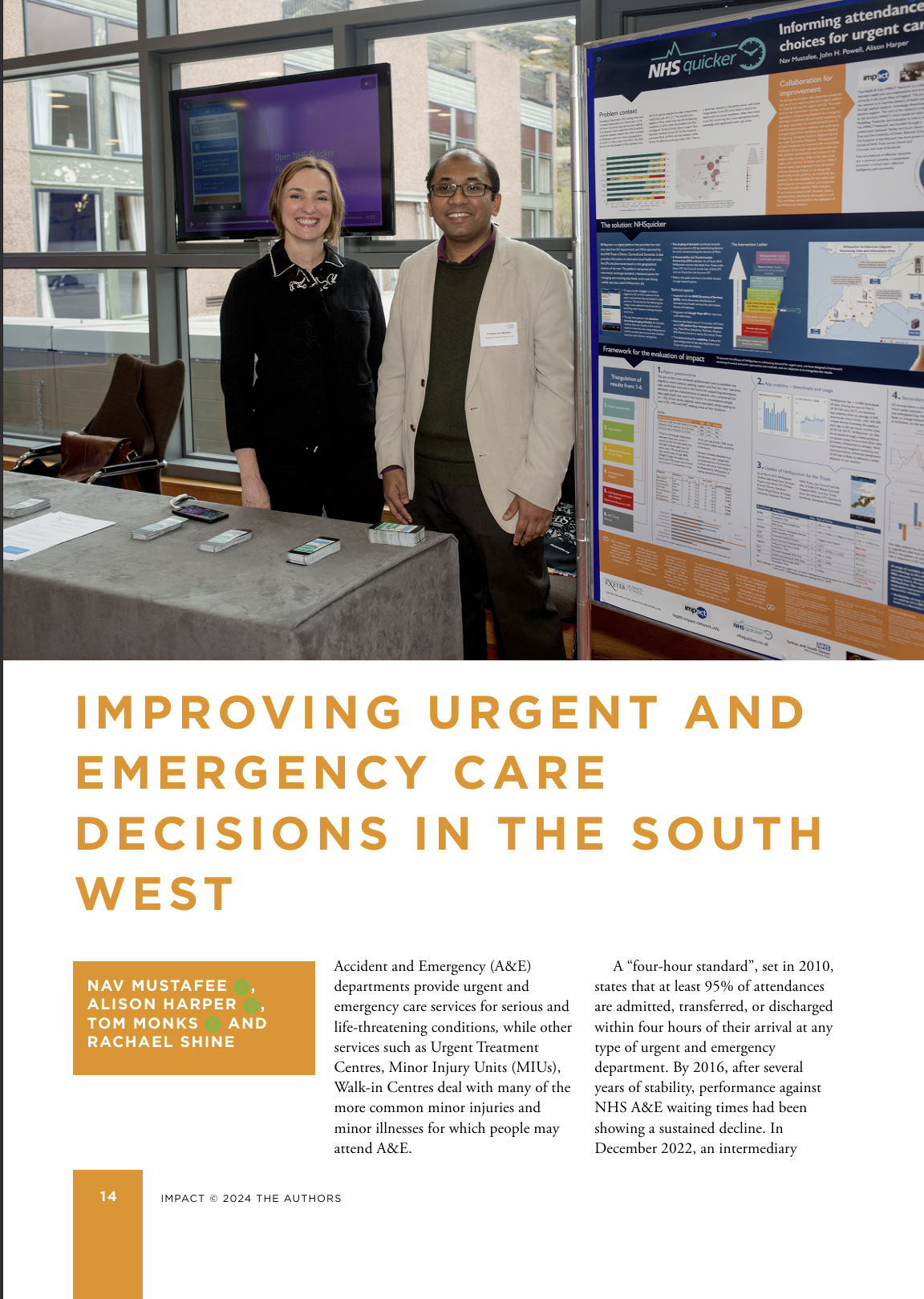
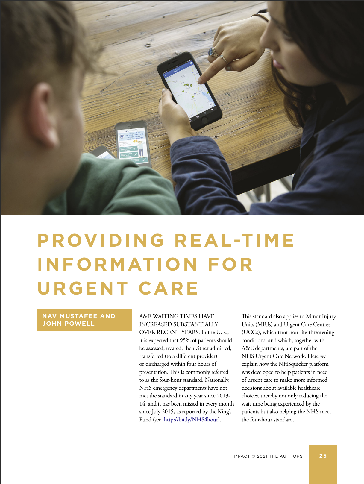
NHSquicker Linked Impact Articles:
Research Papers:
Mustafee, N., Harper, A., Zoppos, G., Fenga, L., & Monks, T. (2026). Predictive triggers based on time-series data for real-time simulation (RTS) experimentation. In Proceedings of the 2026 Winter Simulation Conference (WSC). Accepted.
Chakravarty, S., Kaplan, T. R., & Mustafee, N. (2020). Altering wait time information to reduce A&E overcrowding. Economics Department Discussion Papers Series, ISSN 1473–3307.
Harper, A., & Mustafee, N. (2019). A hybrid modelling approach using forecasting and real-time simulation to prevent emergency department overcrowding. In Proceedings of the 2019 Winter Simulation Conference (WSC) (pp. 1208–1219). IEEE.
Harper, A., & Mustafee, N. (2019). Proactive service recovery in emergency departments: A hybrid modelling approach using forecasting and real-time simulation. In Proceedings of the 2019 ACM SIGSIM Conference on Principles of Advanced Discrete Simulation (pp. 201–204).
Mustafee, N., Powell, J. H., & Harper, A. (2018). RH-RT: A data analytics framework for reducing wait time at emergency departments and centres for urgent care. In Proceedings of the 2018 Winter Simulation Conference (WSC) (pp. 100–110). IEEE.
Papers contextualised with NHSquicker
Harper, A., Mustafee, N., & Viana, J. (2026). Real-time decision-support using simulation (RtS) for operational responsiveness in urgent and emergency care: Bridging the gap between conventional simulation and digital twins. European Journal of Operational Research.
Mustafee, N., Harper, A., Viana, J., & Monks, T. (2024). A maturity model for digital twins in healthcare. In Proceedings of the 2024 Winter Simulation Conference (WSC) (pp. 1151–1162). IEEE.
Mustafee, N., Harper, A., & Viana, J. (2023). Hybrid models with real-time data in healthcare: A focus on data synchronization and experimentation. In Proceedings of the 2023 Winter Simulation Conference (WSC) (pp. 1148–1159). IEEE.
Evidence & Analytics
Since launching in 2017, NHSquicker has expanded to cover 37 urgent care facilities serving 1.9 million people across Devon, Cornwall and Somerset. Early data shows a positive shift in patient behavior, with reductions in A&E attendance and increased use of MIUs and UTCs. The app also won the Lyn Thomas Impact Medal for demonstrating strong real-world impact and was featured as a REF2021 Impact Case Study.
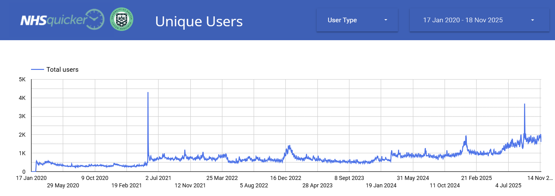
The Unique Users graph shows the number of individual user who engaged with the app on a given day. From when we started collecting data (17th Jan 2020) to 18th November 2025, the number of users per day has gradually increased, and is expected to continue increasing.
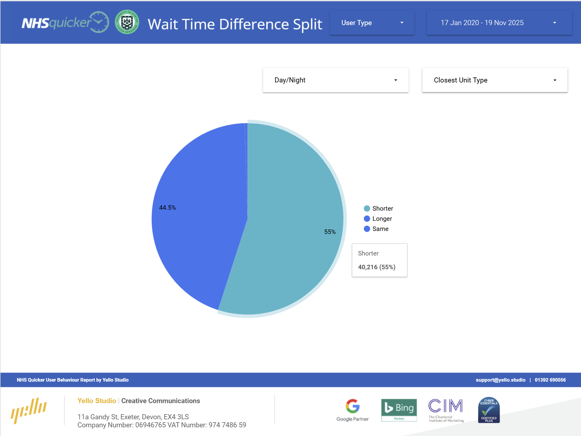
This graph shows summarises user decision-making based on differences in wait times between the closest unit to the user and the unit that the user viewed more options for when viewing wait times on the NHSquicker app. Users most often clicked on units that had shorter wait times than the unit that was closest to them, indicating users are interested in shorter wait times, even if it means travelling further. This highlights the importance of the app for providing real-time wait time information for guiding decisions.
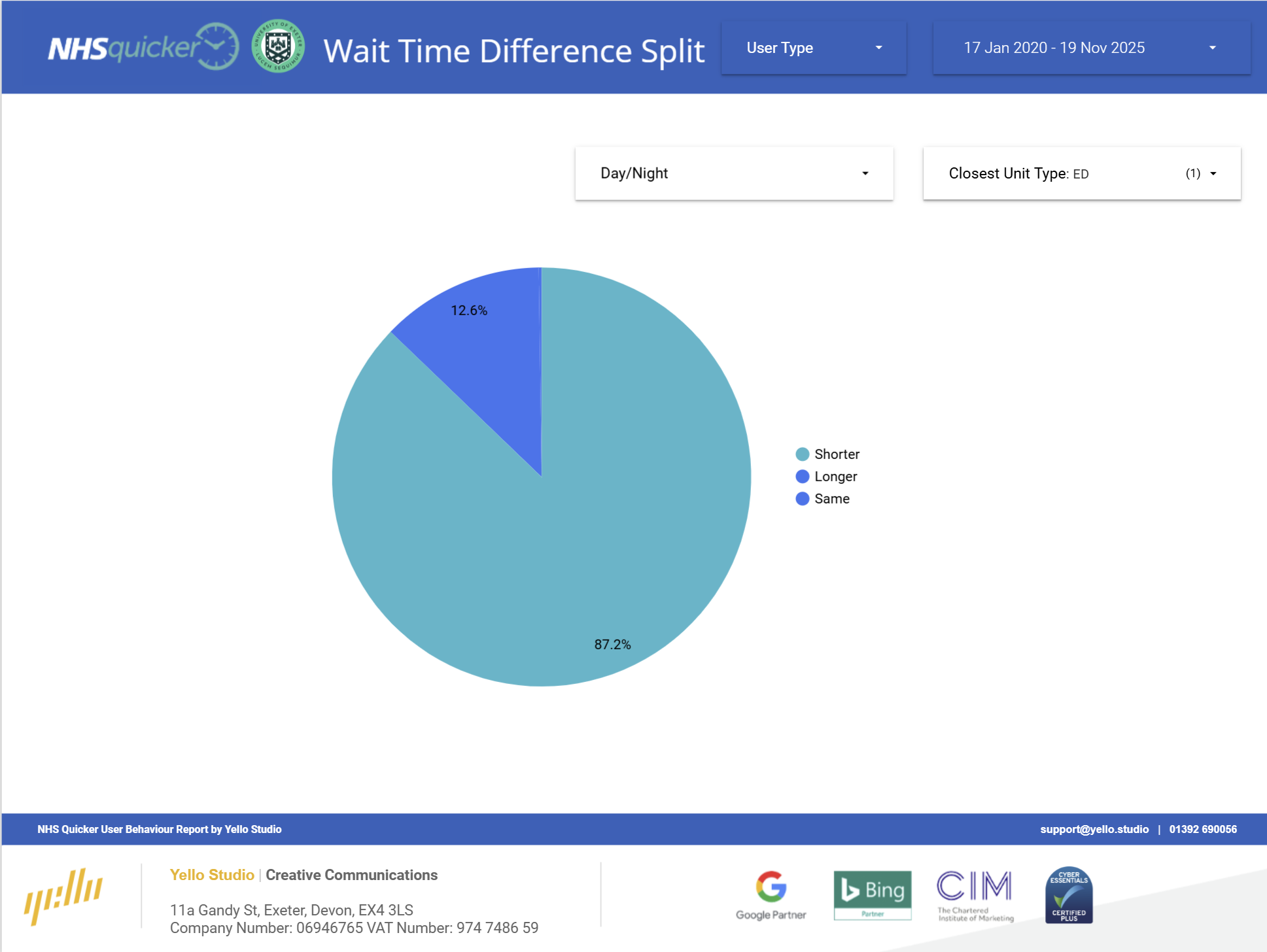
Looking at cases where the nearest unit at the time was an emergency department, the graph shows that from the start of data collection to the present, users selected a unit with a shorter wait 87.2% of the time. The emphasises the usefulness of NHSquicker, and shows its importance in decision making.